PARC: Contrast
Platzi
https://platzi.com/
In this website we can see the principle of the Contrast, we can observe how the page uses a dark colour as the background and a white as the colour of the font improving the readability and creating a good appealing, also the page uses the contrast with buttons using bright colour with darks colours.
PARC: Repetition
Domestika
https://www.domestika.org/en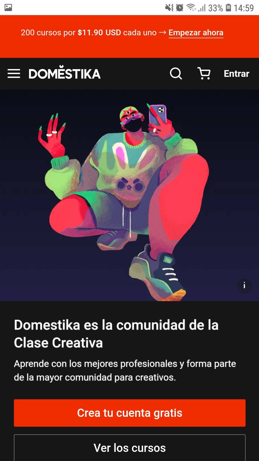
In this website we can see the principle of the Repetition, the page uses the colour red to create this patron of consistency with the background colour of the buttons and announcements, in the child pages also use this colour with its logo. achieving that this colour essential to the identity of the page.
Visual Hierarchy
The Church of Jesus Christ of Latter-day Saints
https://www.churchofjesuschrist.org/?lang=eng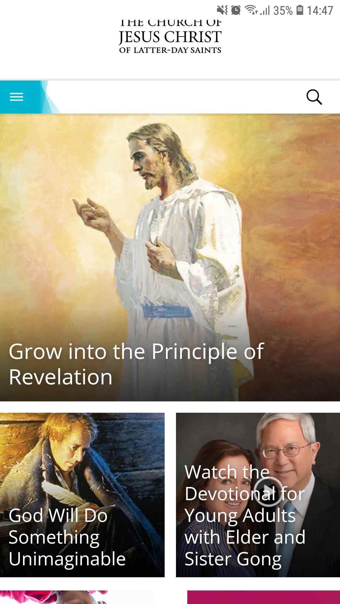
In this website we can see the principle of the Visual Hierarchy, the page uses a lot of images to present the topics and int the top we have a big square image of the principal topic and in the botton more images with less size creating a good appealing. we can add that the use of square of the images helps a lot creating consistency.